Adventure Streaks: a habit system to fight seasonal churn
Komoot is at its best the moment you're outdoors, and silent in between. I designed a habit system, and the seasonal campaign around it, that gives 45 million users a reason to come back every week.
My role
End-to-end designLed research, system design and UI for Adventure Streaks, from segmentation to shipped product.
Getting everyone to agreeRan the cross-functional workshops that turned research into the streak and campaign system.
Campaign integrationCo-designed Adventure into Spring with Brand, and was responsible for integrating it into the product.
RecordResurrection rate
45MUsers reached
Up YoYExploring users
+1.7%Weekly explorers
38.8%Resurrection rate
+10%YoY exploring users
I only have 2 mins
The whole story
The problemRetention
Komoot is seasonal and event-driven: retention and year-over-year reactivation were the growth bottleneck.
The insightBroken habit loop
Holiday and seasonal users make up a majority~60% of the activated base. Komoot already had the action and the reward of a habit loop, what it lacked was a trigger.
What shippedKomoot's Adventure Streaks
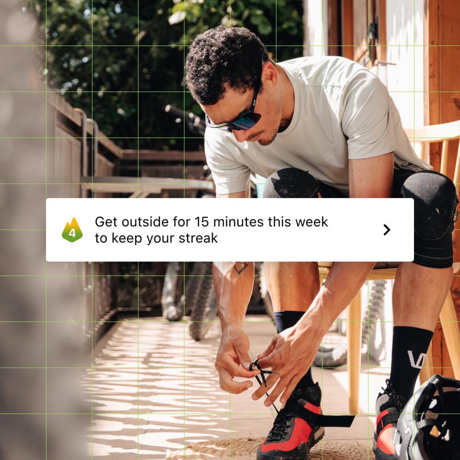
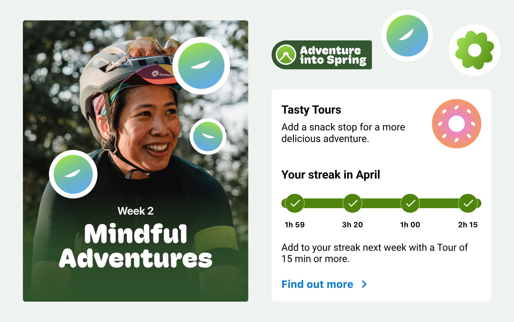
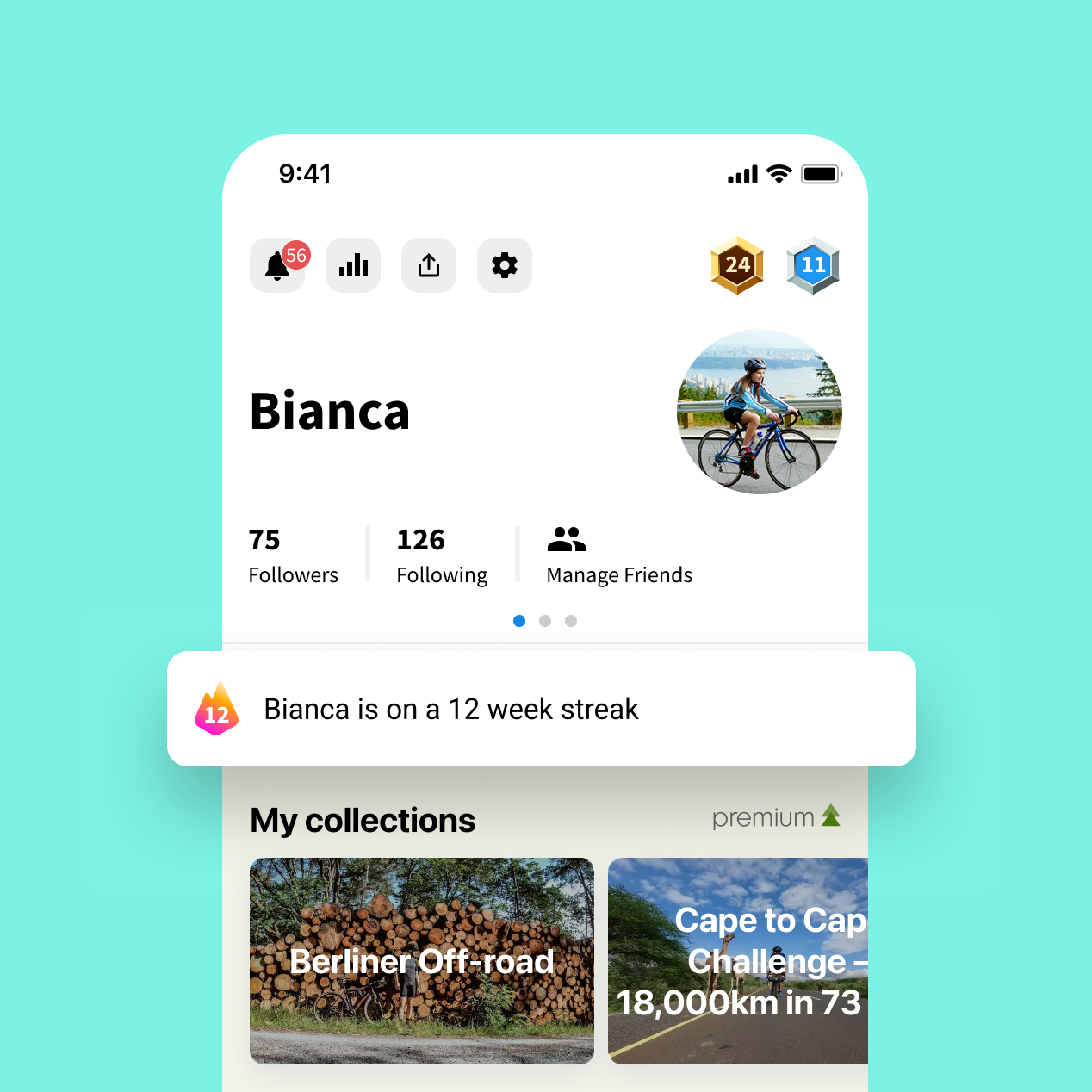
Komoot's Adventure Streaks: go out once a week to continue your streak. Launched together with Adventure into Spring, a 4-week reactivation campaign I co-owned with Brand.
The impactIt worked
Users became more likely to explore weekly. April saw a huge resurrection rate and increase in YoY exploring users.
01
Context
A seasonal, event-driven product
Komoot is a hiking and cycling app with over 45 million users and a household name in Germany. It helps people find, plan, navigate and share outdoor activities across iOS, Android, web, bike computers, smartwatches and e-bike displays.
The happy path is strong: find a route, save it, navigate it, share the experience. But every one of those value moments is tied to a planned trip, not a routine. Usage peaks from spring to early autumn, and even highly engaged users drop off in winter.
That means two structural gaps: drop-off between activities, and drop-off between years.
Strong at the moment of activity: planning, navigating, sharing. Quiet the rest of the week.
The audience makes it harder: from ultra-athletes racing 1,350 km unsupported to someone who hikes twice a summer. Committed users have high lifetime value, but long-term growth depends on retaining and reactivating the casual majority.
02
Discovery
Who are we designing for?
Before Streaks existed, I led a mixed-method research piece that became its foundation: usage-based personas. Starting from an external survey, I identified usage frequency as the simplest common denominator observable in the product. Frequency tells you one thing directly: is this person forming a habit or not?
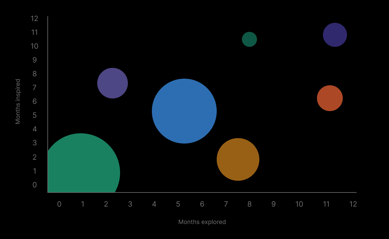
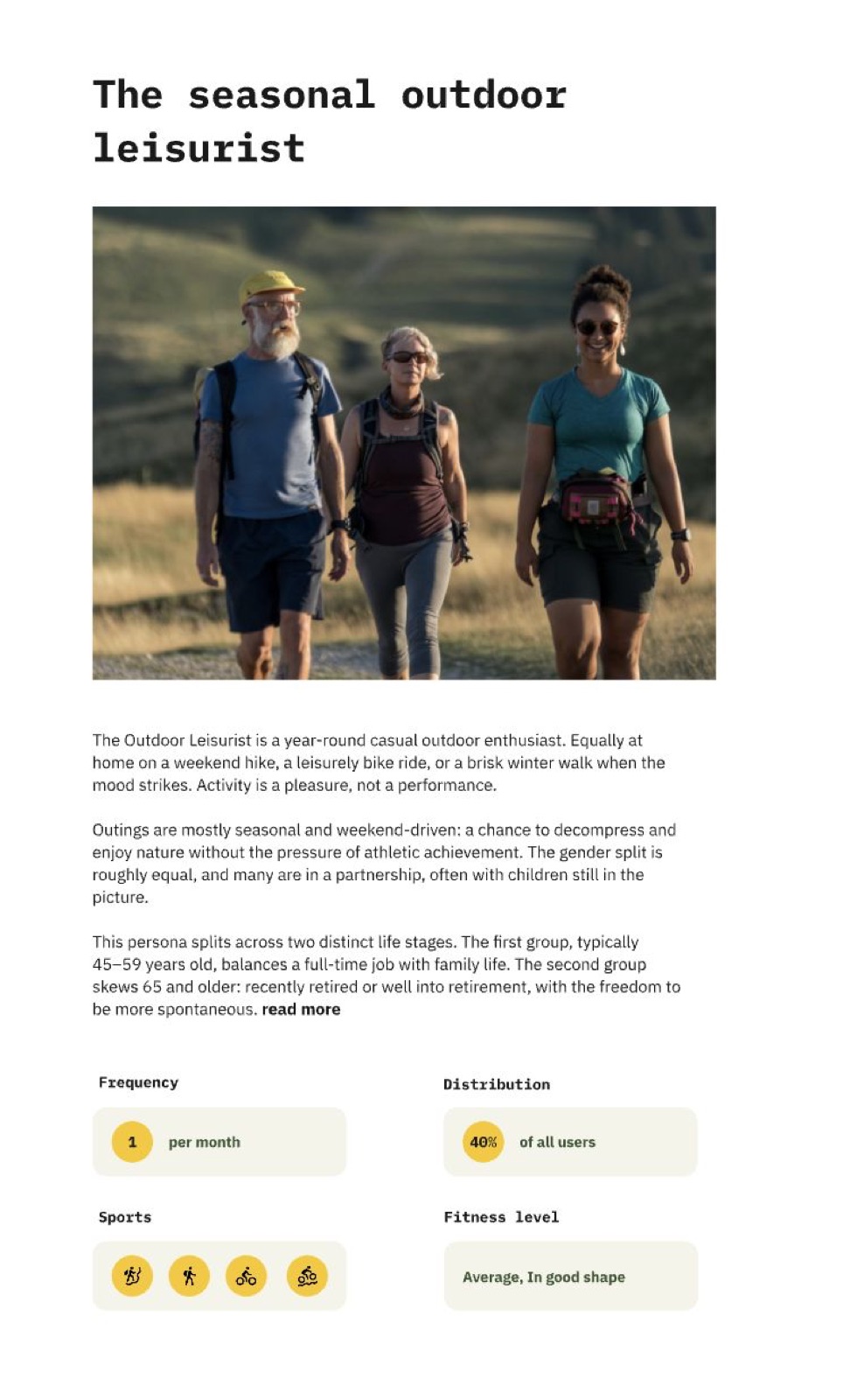
Working with a data analyst, we clustered the full user base by month-over-month usage into seven behavioral segments, from holiday users (one or two active months a year) to year-round users (active every month).
Seven segments, plotted by months explored and months inspired.Segments became personas grounded in product behavior, not assumptions.
Occasional users (bottom left and middle bubble) together make the majority of the activated user base. The opportunity was nudging them up and to the right, building more habit without changing who they are.
What drives people outdoors?
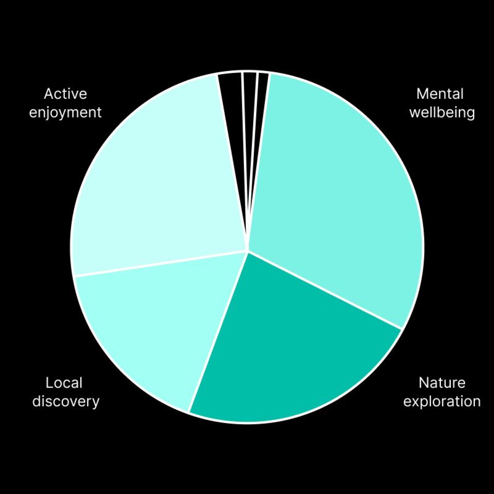
In parallel, a brand survey surfaced four core motivations: mental wellbeing, nature exploration, local discovery and active enjoyment. These later became the backbone of the campaign: each weekly theme mapped to a real user motivation, not an assumed one.
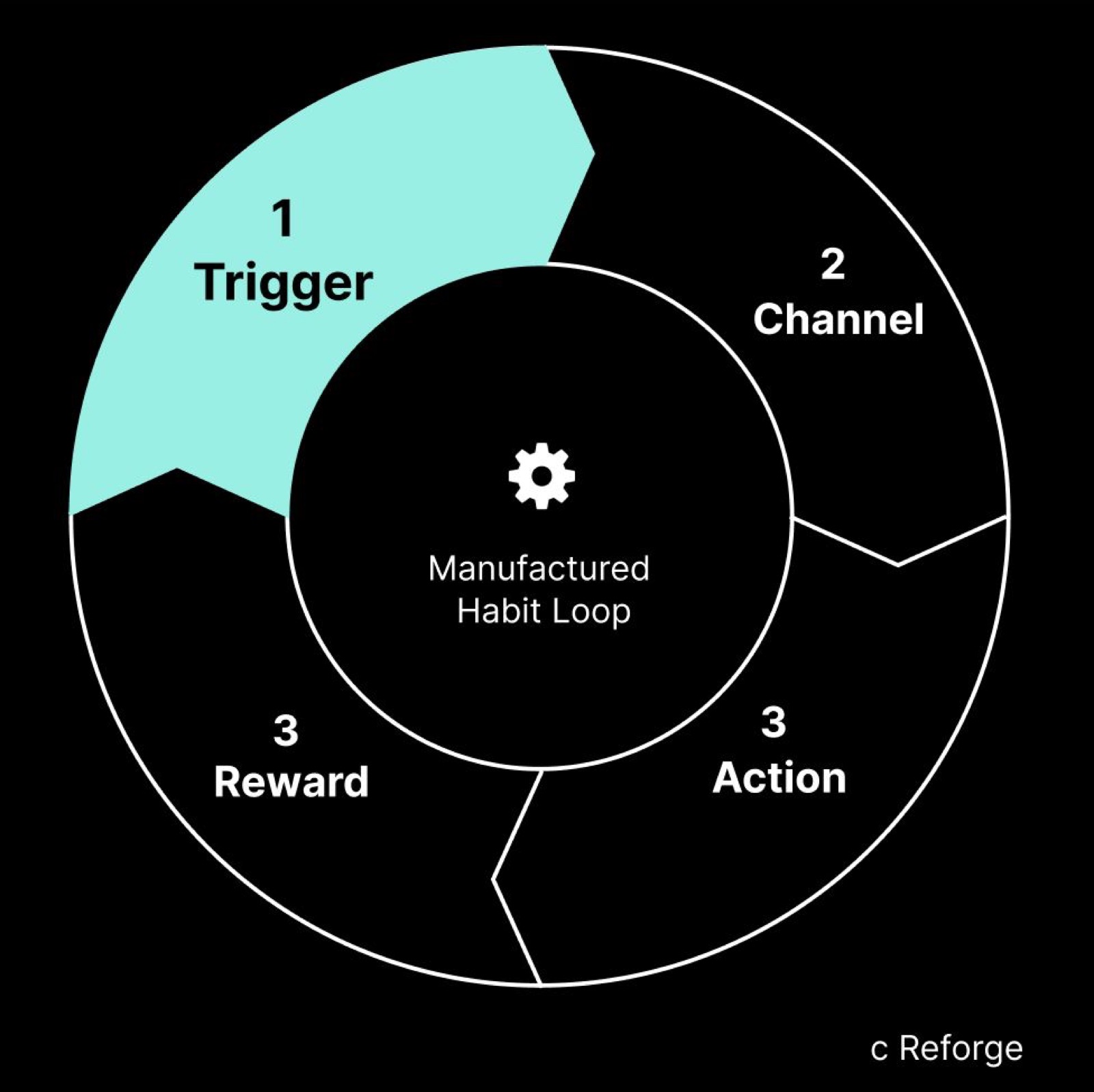
Four motivations, straight from users.Mapped against a manufactured habit loop, the case made itself.
Komoot already had the channel, the action and the reward. What it lacked was a consistent trigger: something to nudge people back before the habit faded. Streaks provided exactly that: a lightweight, self-reinforcing prompt that fit how people already used the product.
The question
How do we stay top of mind while leveraging seasonality?
From workshops to one system
With the segmentation in hand, I led two cross-functional workshops with product, brand, marketing and the founders, around one question: how do we stay top of mind by leveraging seasonality?
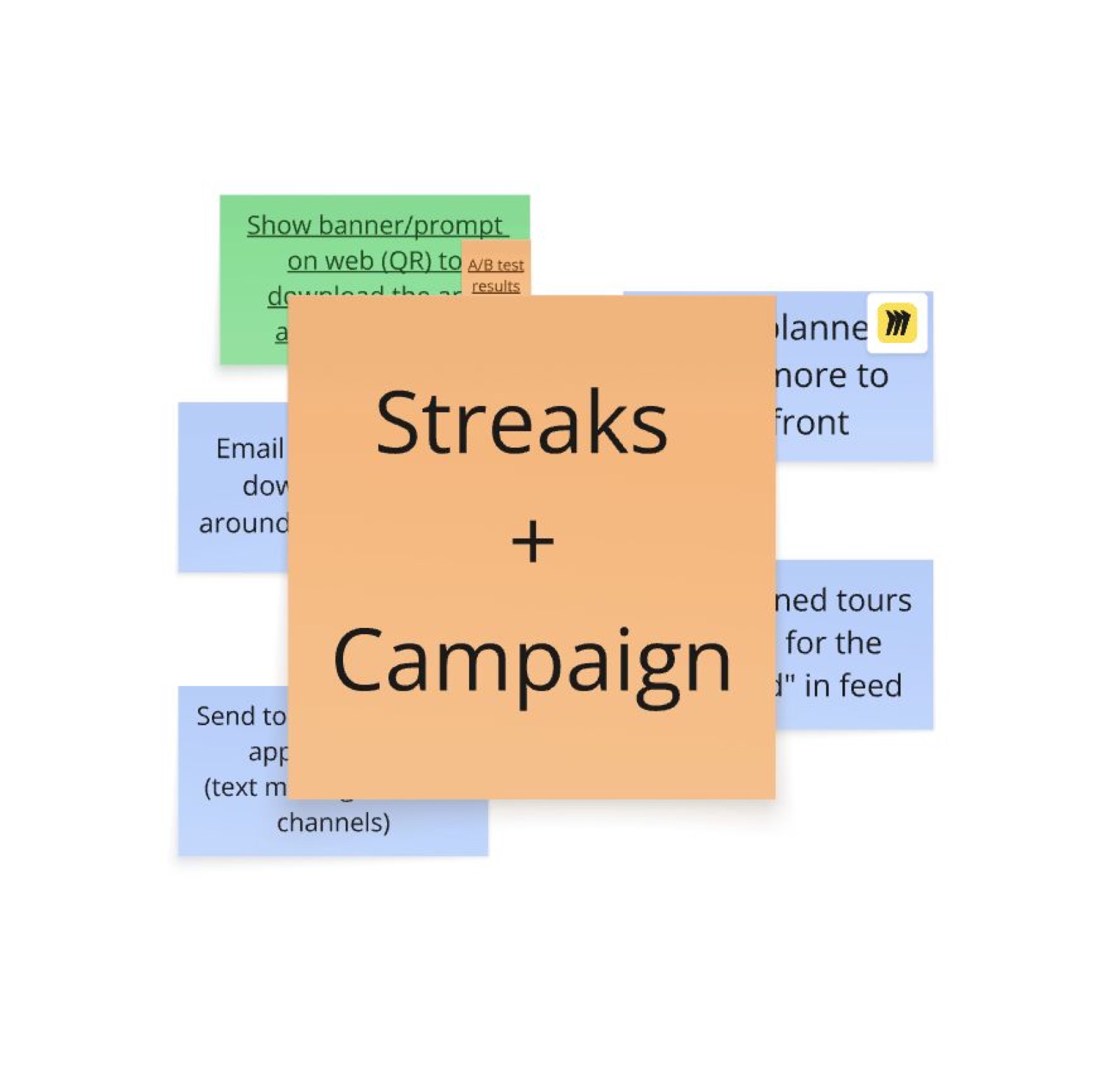
Two directions came out: retention through a habit-building mechanic, and reactivation through a seasonal campaign. We decided to design them as one integrated system.
Two workshops, one decision: streaks and campaign, designed as one system.
03
Ideation & iteration
From workshops to a calibrated mechanic
Three principles that shaped every decision that followed.
1
It's about showing up for the outdoors
Design for whoever shows up and enjoys the outdoors, not for the best explorer.
2
Design the core, build on top
Start with the simplest version that delivers the mechanic. Layer complexity later.
3
Encourage, don't push
A streak invites, it doesn't demand. We want people to be more active and feel good.
Streaks are a known pattern, but what do Komoot's Adventure Streaks look like?
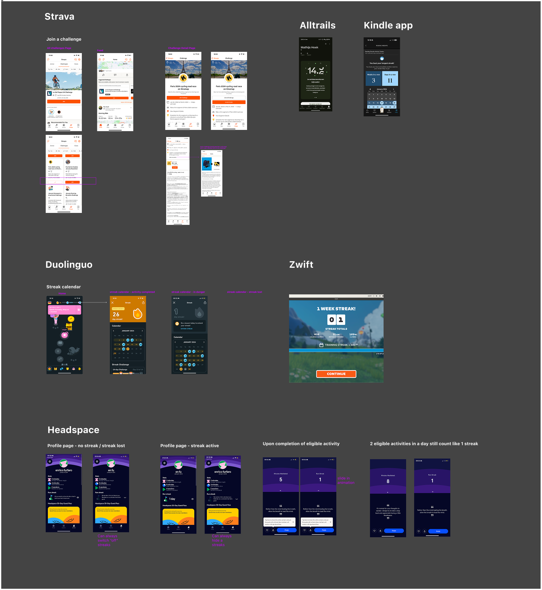
I benchmarked how Duolingo, Zwift, Headspace, Strava, AllTrails and Kindle handle streaks and challenges: what they count, how they forgive, how loud they are.
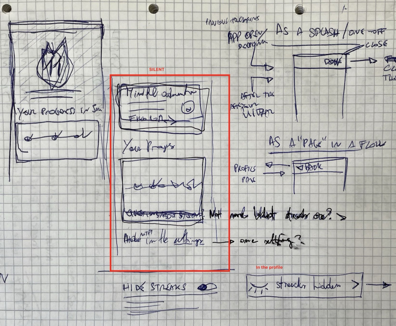
Benchmarking the pattern across Duolingo, Zwift, Headspace, Strava, AllTrails, Kindle.Concepting started on paper: the badge, the widget, the entry points.
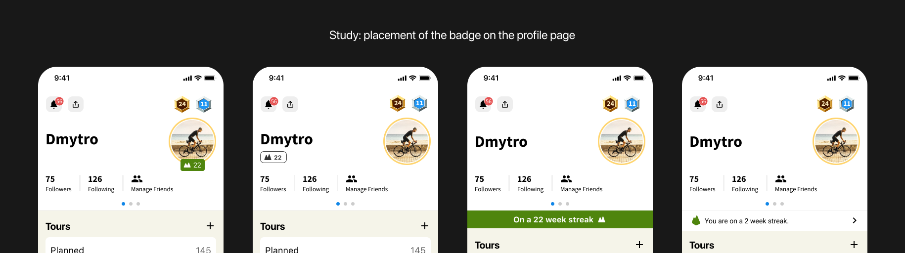
Iterations of the badge and the profile entry point, from first pass to shipped design.
Weekly, and 15 minutes. Why?
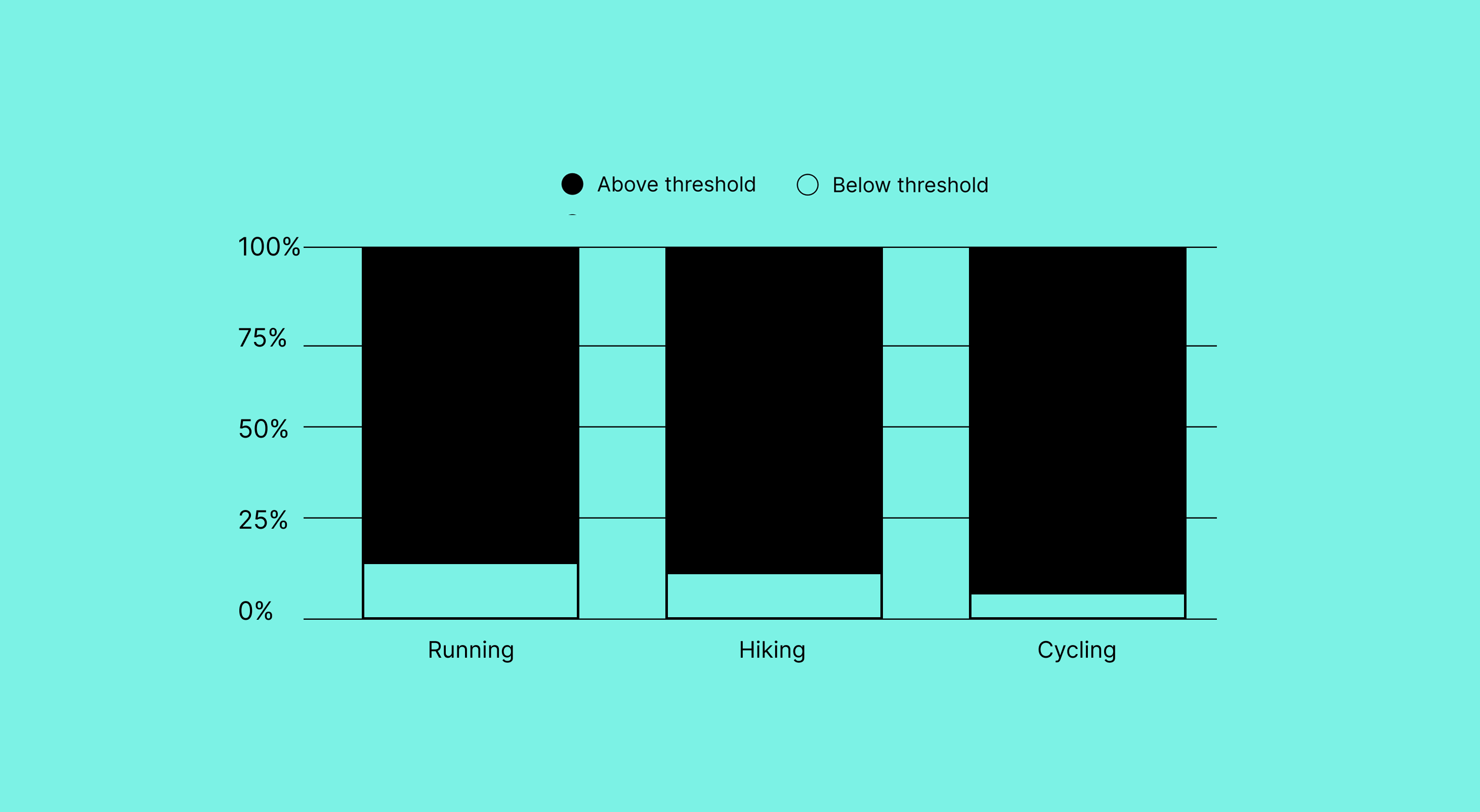
We had to calibrate what counted as a completed activity. Too short and it's meaningless; too long and we exclude casual users. We went into the data: fifteen minutes was the threshold that appeared across running, hiking and cycling as the minimum meaningful activity, inclusive without being trivial.
One threshold that holds across all three major sport types.
04
Concept + Beta testing to create momentum
Building the right thing, right
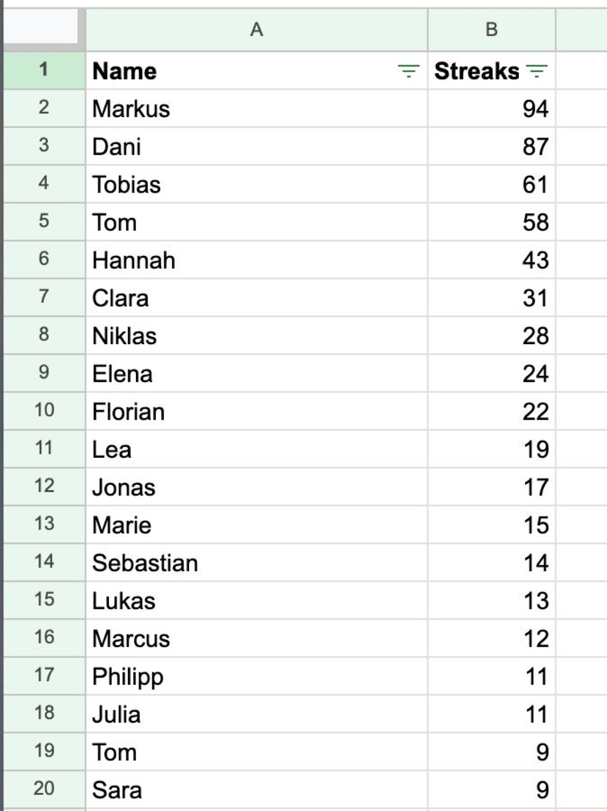
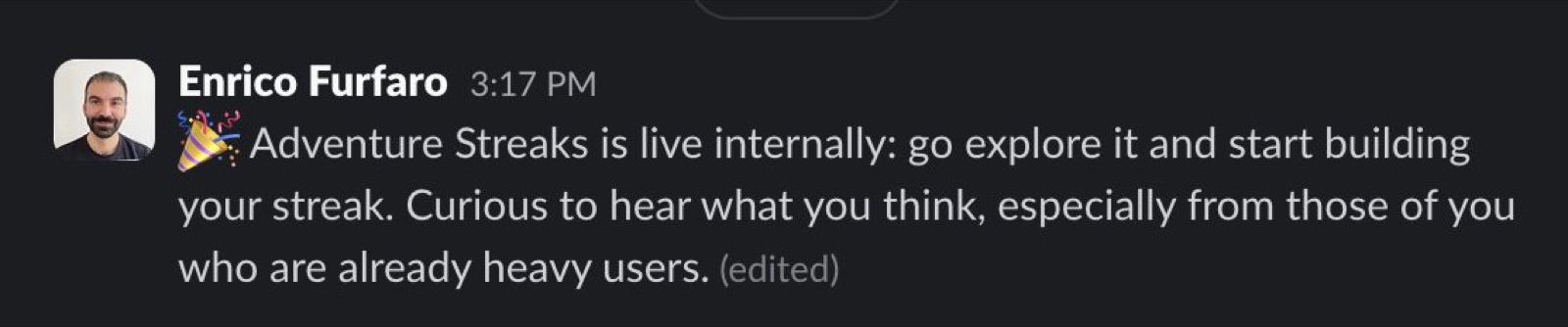
Before we shipped anything, we posted an internal Adventure Streak leaderboard in the company Slack, and watched people immediately get engaged. There was obvious excitement, and some pushback too, given Komoot's spirit of exploration over competition. We noted both and moved forward.
The internal ranking: instant engagement, healthy debate.First stable build went to komooties only.
As soon as we had a stable build, we released it exclusively to employees. Same divisiveness as the leaderboard, but the UI and UX were clear and straightforward. That was the confidence we needed to ship.
Result
A divisive feature, but the UI, UX and value were clear. We gained the confidence to ship it to all users.
05
What shipped
A system, not a feature
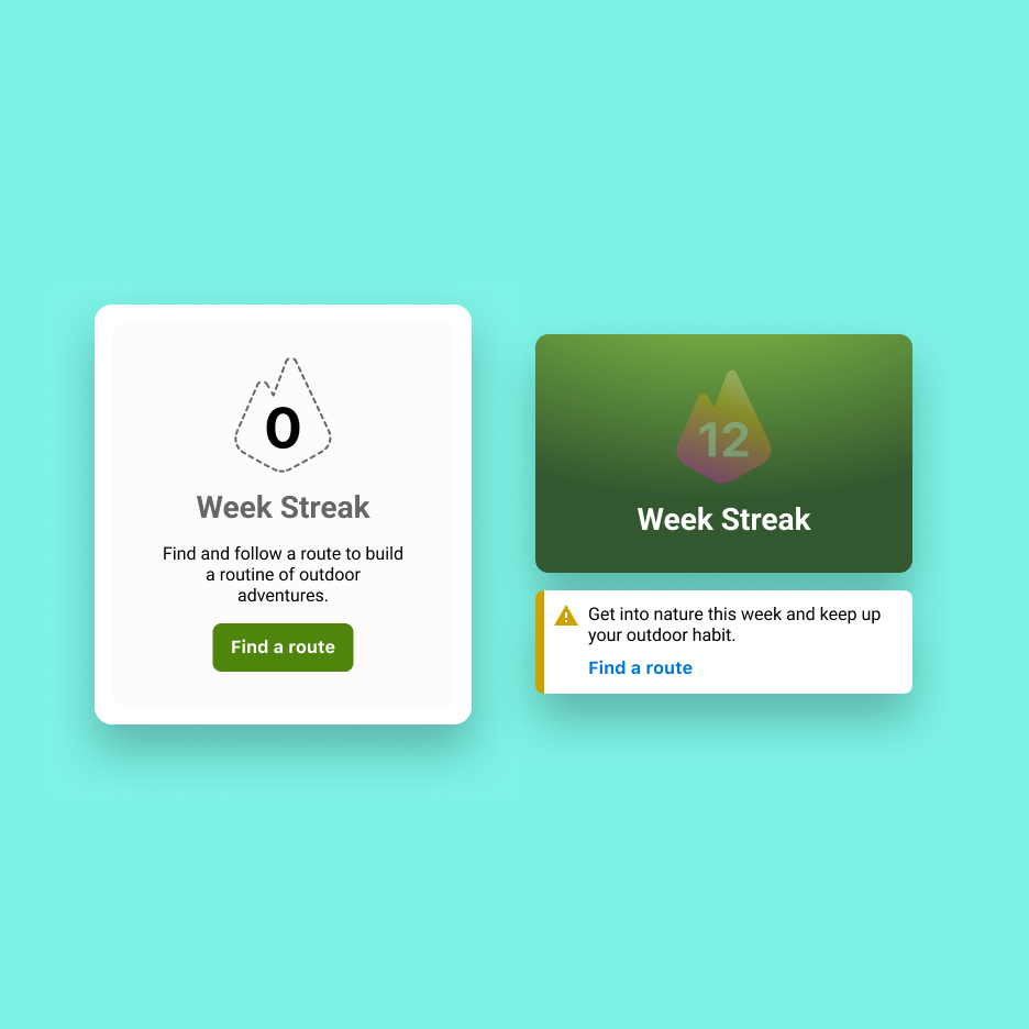
Adventure Streaks rewards users for exploring consecutively every week, nudging them to stay active beyond the season. A streak isn't just an active state; I designed for the full arc: the win, the risk, and the miss.
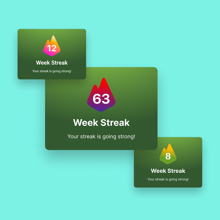
Ongoing: complete an eligible activity and a congratulatory splash celebrates the win.
At risk: fall behind mid-week and the risk state kicks in silently, visible in the timeline without any push.
Elapsed: miss a week and the streak resets. No notification, no guilt; the counter simply reflects it.
The full arc: win, risk, miss. Each with its own voice, none of them loud.
Three components, one coherent system
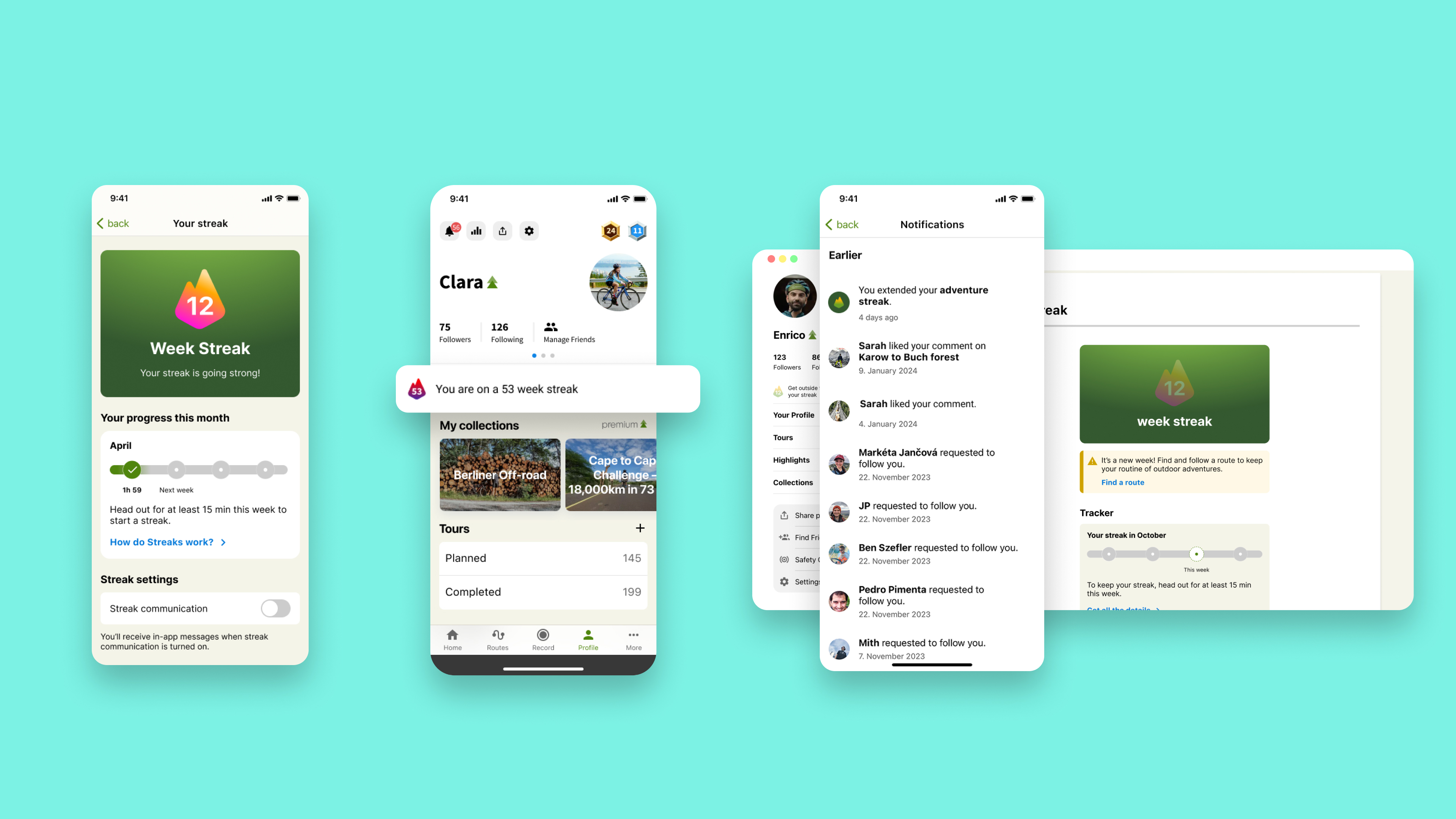
Each piece worked independently across touchpoints (profile, notification badge, desktop, mobile), but the system only made sense as a whole.
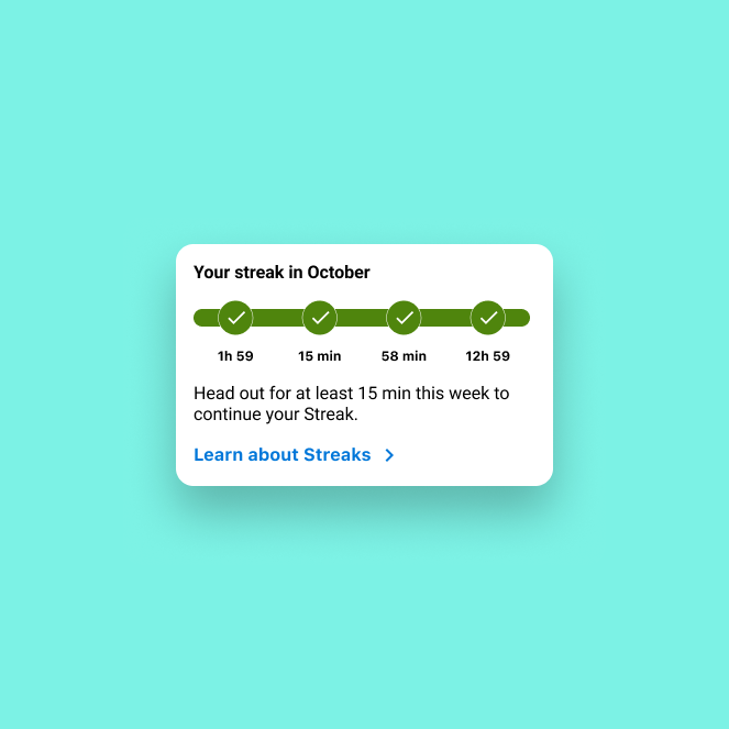
The counter/badge made the streak visible.The progress widget showed the month at a glance.The status update responded to where the user was in their habit.
Touchpoint agnostic
Because each component stood on its own, the streak could surface wherever it made sense: a notification, a badge on a profile, a card on the web. Nothing in the mechanic assumed a particular screen.
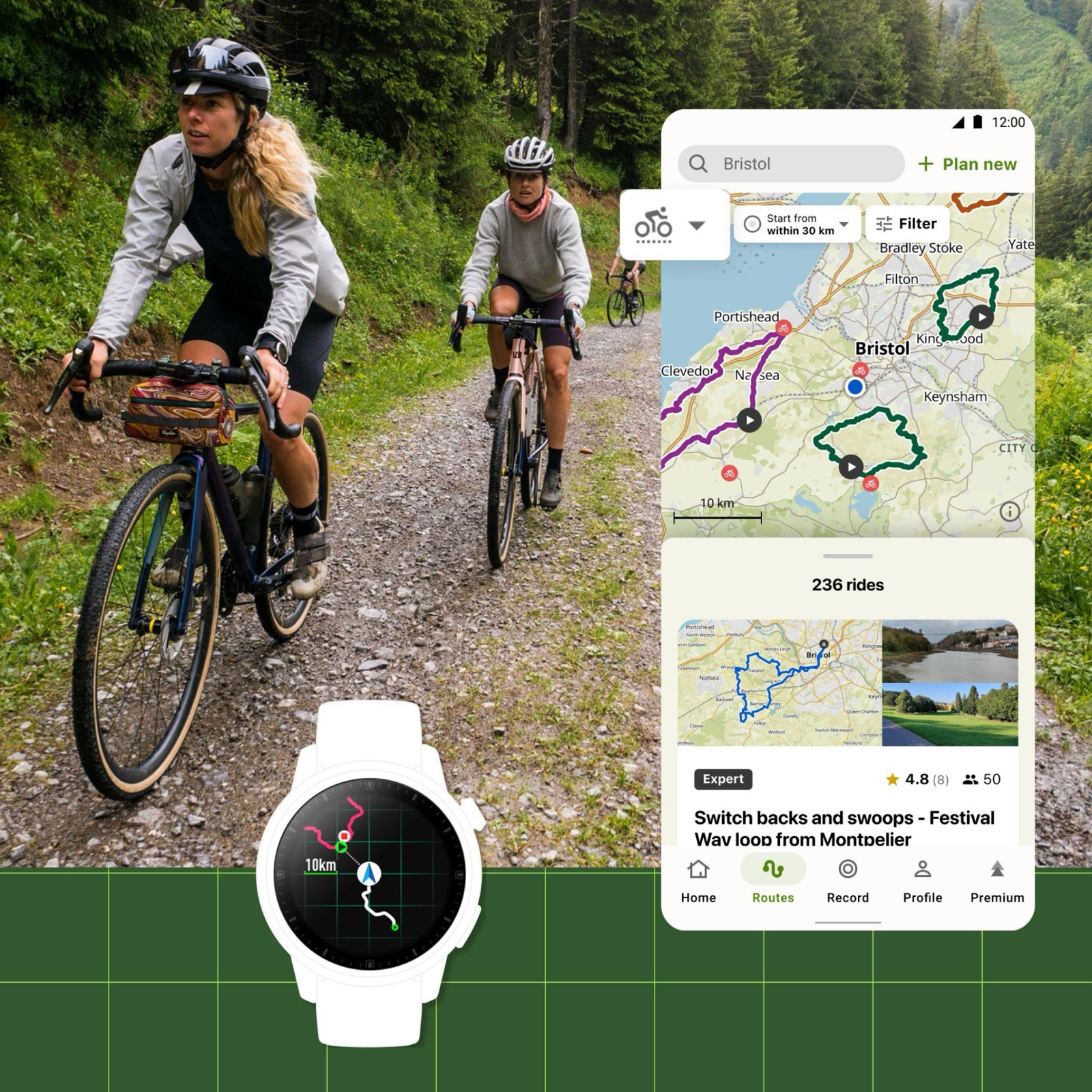
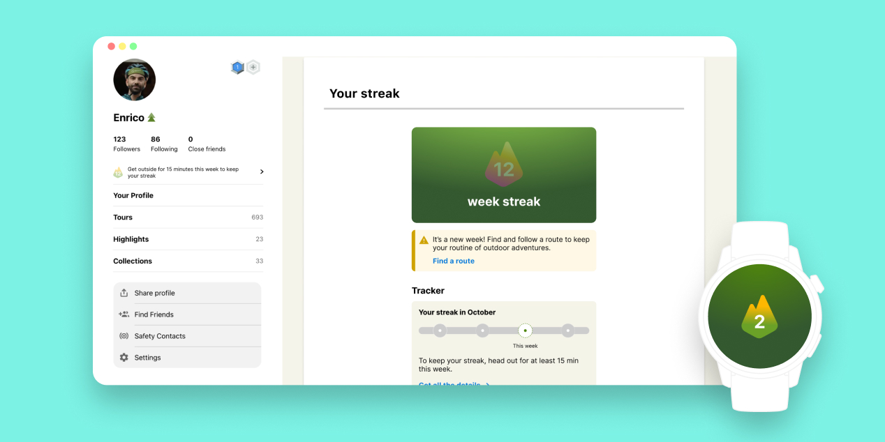
That was the point. Komoot runs on phones, web, bike computers, smartwatches and e-bike displays, so I designed Streaks to adapt to every touchpoint and scale, in time, to every device the ecosystem supported, watches included.
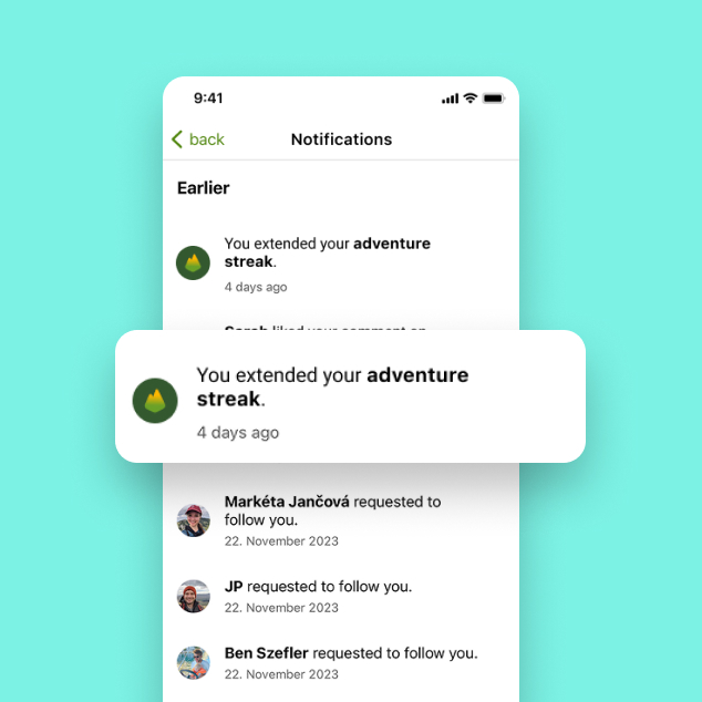
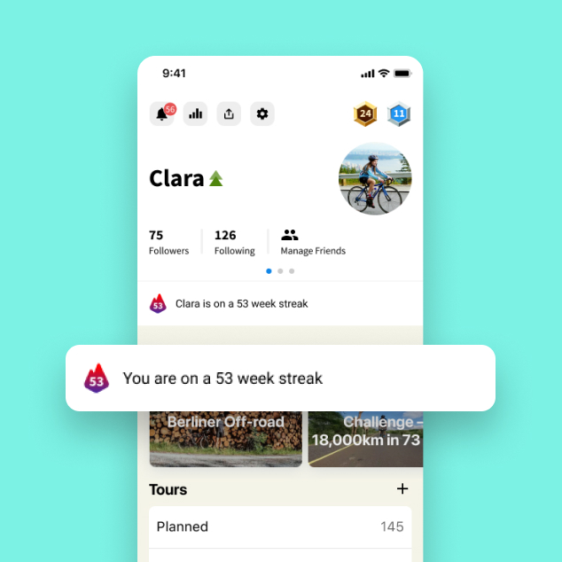
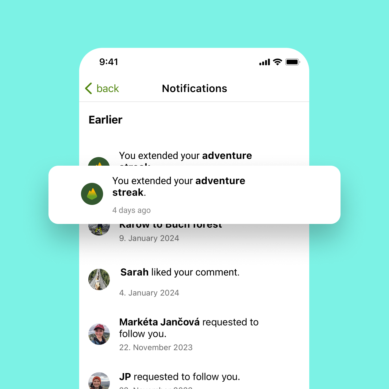
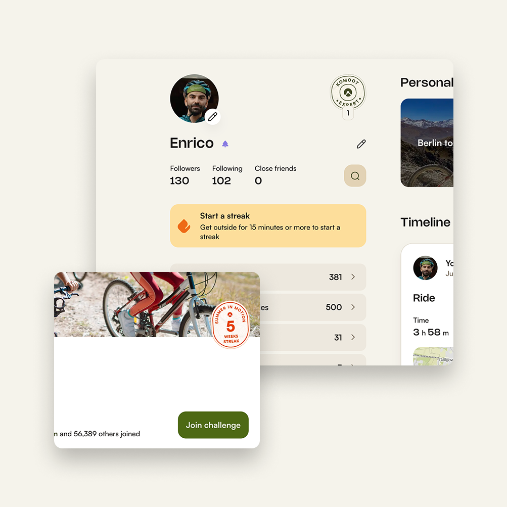
As a notification, the moment the streak extends.As a badge on the profile, public and social.Same system on the web and on the wrist: one mechanic, any device.
Adventure into Spring
Streaks launched alongside a 4-week seasonal reactivation campaign: four weeks, four themes, each mapped to one of the researched motivations. I owned the product touchpoints (in-app campaign page, entry points, widget integration) and worked in parallel with Brand, who owned the visual execution and weekly emails.
Four weeks, four themes, four adventures: the trigger for the habit loop.
06
System thinking
Easy to use, complex to design
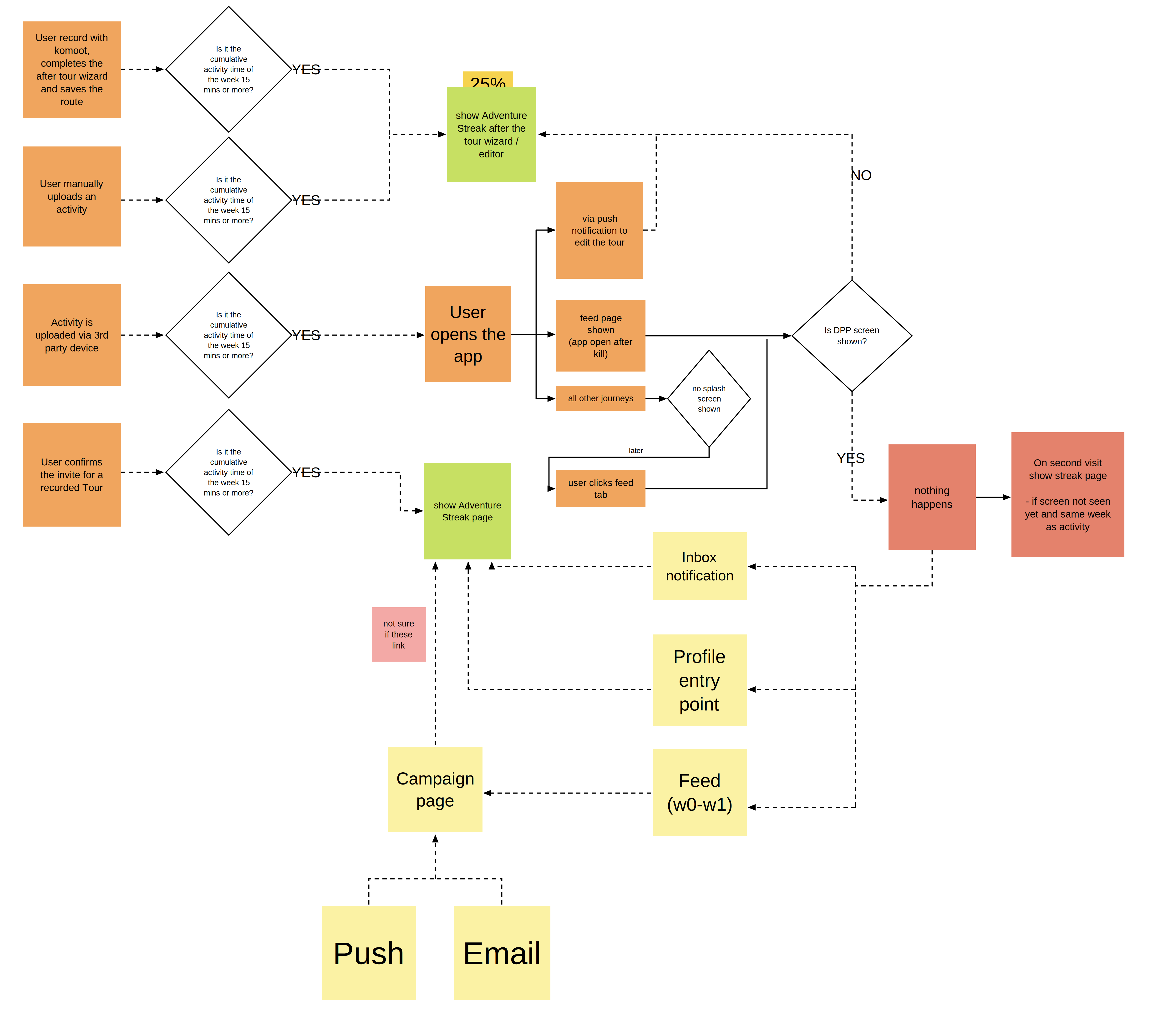
The system had to handle much more than a clean weekly loop. To keep it simple at the user level, I mapped every scenario: eligible activity or not, which week of the month, whether, when and how to show the streak screen.
Every path mapped, so the user never has to think about any of them.
The widget was a fun beast
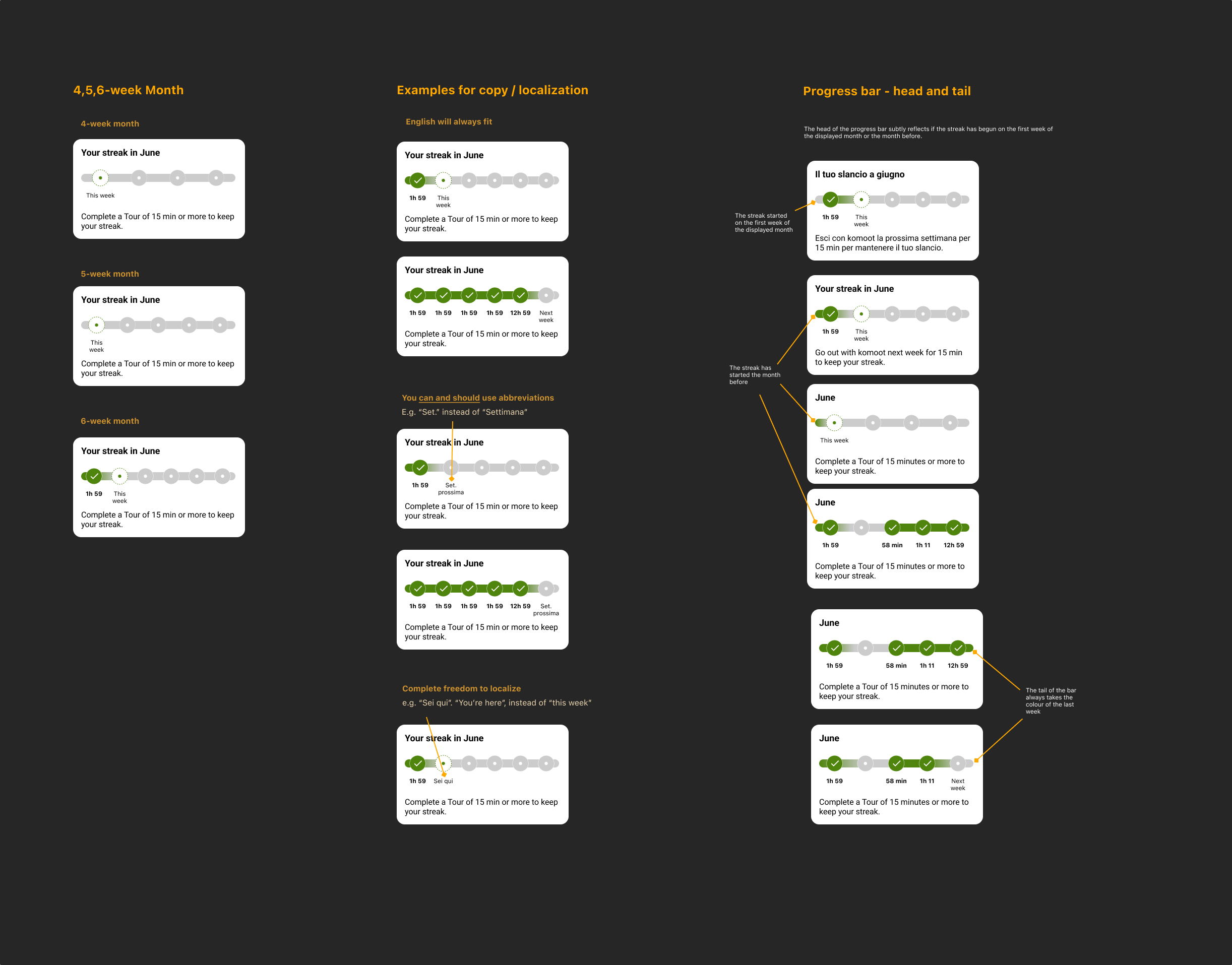
Limited real estate, 10+ languages, and a month that could be four, five or six weeks long. The trickiest part was the microcopy under each week indicator: a label that had to fit in a tiny space across languages where the same word can be twice as long. A lot of exploration went into copy that held up everywhere.
Four-, five- and six-week months × 10+ languages × a few pixels of space.
07
Results
A/B test: splash opted-in vs opted-out by default
We measured the hypothesis that exposure to streak communication drives higher week-over-week exploration consistency, testing users opted in by default against users opted out.
+1.7%
Opted-in users were more likely to explore weekly: that's thousands of peopleover 20,000 people building a more regular habit.
+0.16%
Higher average number of weeks explored among opted-in users who explored.
38.8%
Resurrection rate during the campaign month, the highest since Covid, alongside record+10% YoY exploring users.
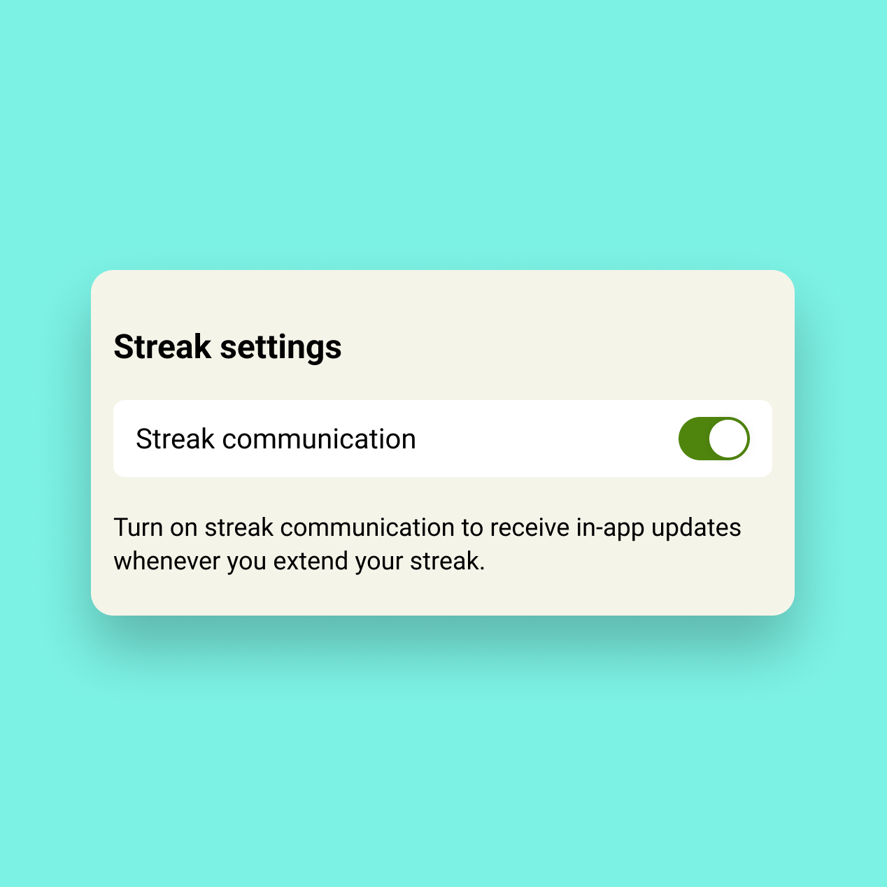
The strongest signal wasn't a percentage: users in the opted-out group actively went into settings to re-enable the streak splash. People who didn't get streak reminders went looking for them.
The signal
The strongest result wasn't the percentage lift. It was people deliberately turning the notifications back on.
08
Decisions and What's Next
Scoped for learning, built to grow
We had five weeks from start to shipping to all users. The goal was learning, not feature completion. Scope stayed tight through continuous stakeholder reviews; everything beyond the core mechanic went to a phase-2 list.
Decisions
Based on the test, we rolled out the splash on by default, while making it easier to disable. Notifications stayed in-app only as a deliberate starting point, keeping the feature gentle for a user base with mixed feelings about gamification.
Comms opted in by default, with an easier way to switch them off.Streaks on the public profile, for social reinforcement.Notifications kept in-app only, a deliberate starting point.
What was next (in theory)
The phase-2 backlog is the roadmap for Streaks 2.0 and beyond: streak reminders, freeze dynamics, a streak calendar, sport-type display, sharing, and anti-cheating mechanics.
What happened instead
I left Komoot not long after, together with the rest of my team. The product has changed a lot since. Even if we were gone before phase 2 could happen, the mechanic outlived us: Streaks remained a foundational habit-building feature and is still in the product today.
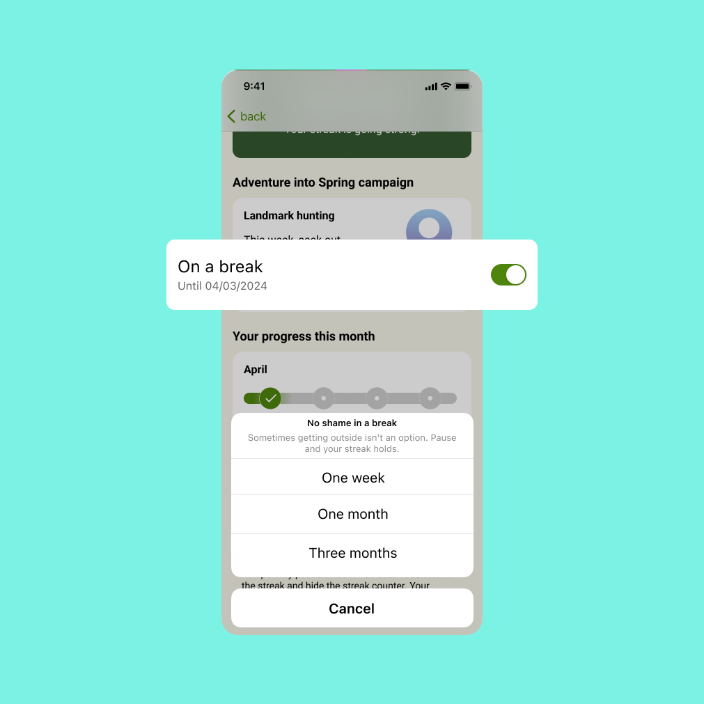
Freeze dynamics: pause for a week, a month or three, and the streak holds.Streaks in Komoot today, now promoting challenges.
09
Learnings
Looking back
The question, answered
How do we stay top of mind while leveraging seasonality? Komoot's Adventure Streaks is the answer.
What worked and what I would do differently?
Brand, marketing and product built one thing. The first time a feature and a campaign were designed together, and the work was better for it.
Fifteen minutes was the right threshold. It held across running, hiking and cycling: inclusive enough for casual users, meaningful enough to count.
We over-communicated that threshold. So invested in finding it that we pushed it everywhere. Users only needed to know: go outside this week.
Most people loved Streaks, but some properly hated it. Looking back, with more time we could have interviewed the sceptics and understood how to address their concerns as the product evolved.
This was pre-AI, and a lot would be done differently now. With more time, prototyping the mechanic would have been top of the list.
Want the full walkthrough?
This project is also a talk: data, workshops, edge cases and all. Happy to walk you through it.